
Exploratory Data Analysis and Two Regression Algorithms in R
Introduction
This exercise details my analysis done with two important metrics in a data sample: the service time and the quality score. Factors such as sites, clients, supervisors, and agents are considered as to how they relate to the two business metrics.
There are three parts to my analysis: data exploration, data preprocessing, and data modeling.
Data Exploration
Data Import
## Warning: package 'randomForest' was built under R version 3.5.3

## Warning: package 'car' was built under R version 3.5.3

## Warning: package 'Hmisc' was built under R version 3.5.3

## Warning: package 'ggplot2' was built under R version 3.5.3
After requesting R libraries, the data set is imported into R as a tibble, with the columns renamed for ease of reference.
## # A tibble: 6 x 7
##   site  client supervisor agent  week service_time quality_score
##   <chr> <chr>  <chr>      <dbl> <dbl>        <dbl>         <dbl>
## 1 E     A      Brian         41     1          509           6.5
## 2 E     A      Brian         41     2          505           6.9
## 3 E     A      Brian         41     3           NA           5.9
## 4 E     A      Brian         41     4          505           7.1
## 5 E     A      Brian         41     5          511           9.1
## 6 E     A      Brian         42     1          511           6.8
Let’s first take a look at the summary of the data:
##      site              client           supervisor            agent
##  Length:240         Length:240         Length:240         Min.   : 1
##  Class :character   Class :character   Class :character   1st Qu.:13
##  Mode  :character   Mode  :character   Mode  :character   Median :24
##                                                           Mean   :24
##                                                           3rd Qu.:36
##                                                           Max.   :48
##
##       week    service_time quality_score
##  Min.   :1   Min.   :402   Min.   :4.3
##  1st Qu.:2   1st Qu.:451   1st Qu.:5.9
##  Median :3   Median :470   Median :6.9
##  Mean   :3   Mean   :475   Mean   :6.9
##  3rd Qu.:4   3rd Qu.:511   3rd Qu.:7.7
##  Max.   :5   Max.   :550   Max.   :9.3
##              NA's   :9     NA's   :6
With just 240 rows and 7 columns, this is a fairly small data set. There are a few things that immediately stick out:
There are two quantative metrics: service time and quality score. The rest of the features are categorical, including site, client, supervisor, and agent agent.
Feature selection should be done with caution since some of the factors may be perfectly collinear or even repetitive, e.g., supervisors and agents are nested within site.
Data Distribution
Now explore each column in the data by showing a table of each categorical variable and a histogram of each numerical variable.
# site Frequency Table
table(call$site)
##
##  E  N  S
## 80 80 80
# client Frequency Table
table(call$client)
##
##   A   B
## 120 120
# supervisor Frequency Table
table(call$supervisor)
##
##    ADREEW    Andrew    ANDREW     Brian     David      Eric    George
##         1        16         3        20        20        20        20
##      John      JOHN JOHNATHAN     Jorge     JORGE    JORRGE     Julie
##        12         7         1        16         3         1        20
##     Kathy   Michael   MICHAEL  Samantha  SAMANTHA      SARA     Sarah
##        20        16         4        12         8         1        16
##     SARAH
##         3
# agent Frequency Table
table(call$agent)
##
##  1  2  3  4  5  6  7  8  9 10 11 12 13 14 15 16 17 18 19 20 21 22 23 24 25
##  5  5  5  5  5  5  5  5  5  5  5  5  5  5  5  5  5  5  5  5  5  5  5  5  5
## 26 27 28 29 30 31 32 33 34 35 36 37 38 39 40 41 42 43 44 45 46 47 48
##  5  5  5  5  5  5  5  5  5  5  5  5  5  5  5  5  5  5  5  5  5  5  5
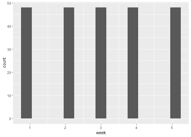
# week Information Histogram
ggplot(data = call, mapping = aes(x = week)) +
  geom_histogram(binwidth = 0.3)
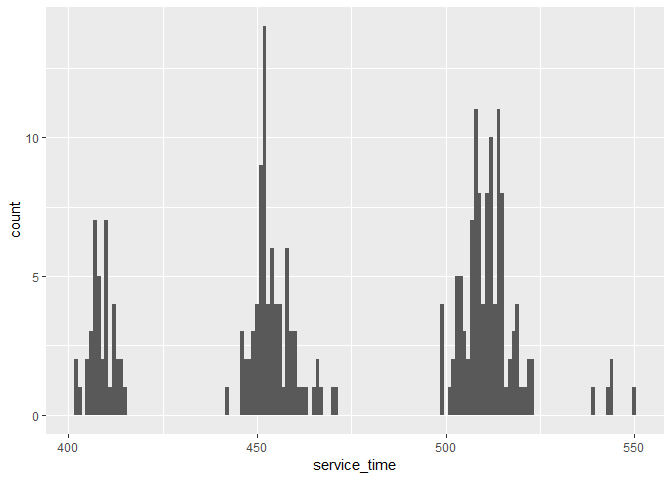
# Service Time Histogram
ggplot(data = call, mapping = aes(x = service_time)) +
  geom_histogram(binwidth = 1)
## Warning: Removed 9 rows containing non-finite values (stat_bin).
# Quality Score Histogram
ggplot(data = call, mapping = aes(x = quality_score)) +
  geom_histogram(binwidth = 0.1)
## Warning: Removed 6 rows containing non-finite values (stat_bin).
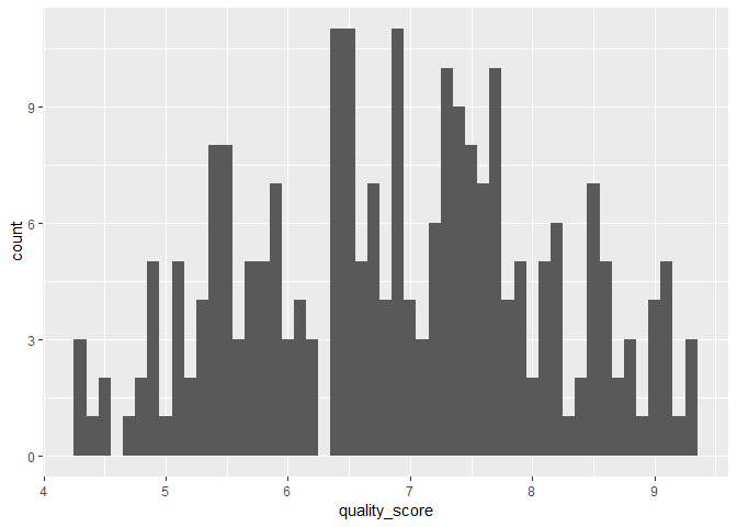
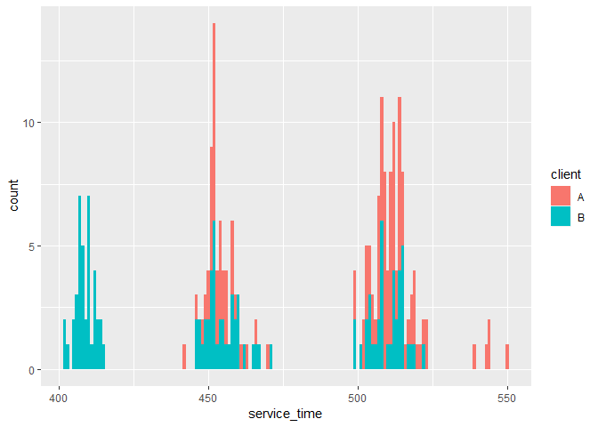
From the visualization above, there is a good and even distribution of data points across sites, clients, and agents. But some supervisors have very few calls associated with them, which may be due to recording errors. The distributions of week information and quality score look fine, but service time was distributed quite sparsely around several means. This could suggest that some factors have a strong effect in determining the service times, e.g., different sites have quite different service times due to logistics etc.
Data Means
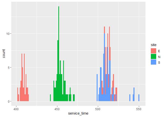
A breakdown of the service time metric over sites and clients shows that indeed very different service times are associatied with different sites, but not different clients.
## Warning: Removed 9 rows containing non-finite values (stat_bin).
## Warning: Removed 9 rows containing non-finite values (stat_bin).
Both the service time and quality score metrics are plotted over the site and client information to give us a better sense of what might come into play.
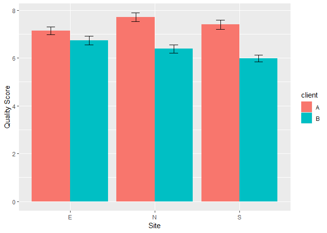
The above figure shows that service with client A has a higher quality score across sites, especially at the North and South sites.
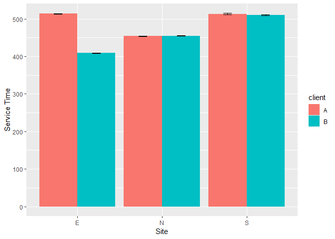
From the above figure, different sites indeed have different service times, with little variation. The East site is an anomaly in that their service time depends on the client being serviced. The barely visible error bars (standard error) suggests that the site and client information can predict the service times fairly well.
Data Preprocessing
Recording Errors
A closer look at the supervisor’s names revealed that some names were spelled wrong (e.g., ‘Sarah’ as ‘SARA’), while some were recorded without proper case (e.g., ‘Michael’ as ‘MICHAEL’). This was corrected so that now each supervisor has 20 entries in the data.
Here’s a table of the corrected supervisor names.
##
##   Andrew    Brian    David     Eric   George     John    Jorge    Julie
##       20       20       20       20       20       20       20       20
##    Kathy  Michael Samantha    Sarah
##       20       20       20       20
Missing Data
First, get an idea of the amount of data missing, the number of missing data points and incomplete data rows.
## Warning: package 'mice' was built under R version 3.5.3

## [1] "Number of missing data points: 15"

## [1] "Number of missing data points per column:"

## column_6 column_7
##        9        6
It turned out that there were 15 out of 1920 data points (0.78%) missing, which is not a big deal. But with 15 out of 240 rows (6.25%) incomplete, this is a bit concerning. Since all missing values were from the two most important features: quality score and service time, a quick multivariate imputation using the mice package was completed.
Data Conversion
Lastly, the data was prepared for modeling by converting character variables to factors.
Data Modeling - Linear Regression
Both service time and quality score are analyzed as outcome metrics in this section. For each analysis there are two parts. First, assumptions are tested, focusing on the multicollinearity assumption based on data exploration. Second, variables are selected based on single-predictor model performance as well as stepwise model selection.
Predicting Service Time
Assumption Test
Based on the Data Exploration section, the multicollinearity assumption is a potential concern for this data set, especially among the several categorical variable. Thus Chi-square test is performed to test the multicollinearity assumption.
## [1] "These two variables are not significantly correlated:"
## [1] "client and site"
##
##  Pearson's Chi-squared test
##
## data:  call[, vars[i]] and call[, vars[j]]
## X-squared = 0, df = 2, p-value = 1
The test showed that only client and site variables are independent of each other. Thus these two variables will be used to predict the service time and quality score in the linear regression model, when multiple predictors are considered.
Building Model
First, one-predictor only models are considered. Service time is predicted from every other factor in the data except quality score. Presumably quality was assessed after the call, thus it was not suitable to serve as a predictor for service time.
## [1] "Adjusted R Squared with Each Predictor: "

##        site      client supervisorN       agent        week
##      0.3692      0.1740      0.8966      0.9201     -0.0042
The above adjusted R Square table showed that both supervisor and agent can alone predict the service time really well. Given that agent has 48 levels while supervisor has only 12 levels, supervisor would be a good predictor to use.
Multiple regression is also considered, with site and client as predictors given the multicollinearity constraint as tested earlier, as well as the simple correlation between these two factors and the service time.
## Analysis of Variance Table
##
## Response: service_time
##            Df Sum Sq Mean Sq F value Pr(>F)
## site        2 144974   72487    98.6 <2e-16 ***
## client      1  68716   68716    93.5 <2e-16 ***
## Residuals 236 173456     735
## ---
## Signif. codes:  0 '***' 0.001 '**' 0.01 '*' 0.05 '.' 0.1 ' ' 1

## [1] "Adjusted R Squared with Site and Client as Predictors: "

## [1] 0.55
The result suggests that both site and client play significant roles in determining service time. However, the combined predictive power is far less ideal compared to supervisor alone as predictor. Considering the interaction seen in the bar plot visualization, an interaction term is added.
## Analysis of Variance Table
##
## Response: service_time
##              Df Sum Sq Mean Sq F value Pr(>F)
## site          2 144974   72487     435 <2e-16 ***
## client        1  68716   68716     413 <2e-16 ***
## site:client   2 134506   67253     404 <2e-16 ***
## Residuals   234  38951     166
## ---
## Signif. codes:  0 '***' 0.001 '**' 0.01 '*' 0.05 '.' 0.1 ' ' 1

## [1] "Adjusted R Squared with Site, Client, and interaction as Predictors: "

## [1] 0.9
Now the predictive power (amount of variance explained) looks much better. The result confirms what we see in the data exploration section.
Model Selection
## Start:  AIC=1213
## service_time ~ site + client + agent + week + quality_score +
##     supervisorN
##
##
## Step:  AIC=1213
## service_time ~ site + client + agent + week + quality_score
##
##
## Step:  AIC=1213
## service_time ~ site + agent + week + quality_score
##
##
## Step:  AIC=1213
## service_time ~ agent + week + quality_score
##
##                 Df Sum of Sq    RSS  AIC
## - week           1         2  24823 1211
## - quality_score  1        28  24848 1212
## <none>                        24820 1213
## - agent         47    362239 387060 1779
##
## Step:  AIC=1211
## service_time ~ agent + quality_score
##
##                 Df Sum of Sq    RSS  AIC
## - quality_score  1        32  24854 1210
## <none>                        24823 1211
## + week           1         2  24820 1213
## - agent         47    362284 387107 1777
##
## Step:  AIC=1210
## service_time ~ agent
##
##                 Df Sum of Sq    RSS  AIC
## <none>                        24854 1210
## + quality_score  1        32  24823 1211
## + week           1         6  24848 1212
## - agent         47    362291 387145 1775

## Stepwise Model Path
## Analysis of Deviance Table
##
## Initial Model:
## service_time ~ site + client + agent + week + quality_score +
##     supervisorN
##
## Final Model:
## service_time ~ agent
##
##
##              Step Df Deviance Resid. Df Resid. Dev  AIC
## 1                                   190      24820 1213
## 2   - supervisorN  0  0.0e+00       190      24820 1213
## 3        - client  0  4.0e-11       190      24820 1213
## 4          - site  0  2.2e-11       190      24820 1213
## 5          - week  1  2.4e+00       191      24823 1211
## 6 - quality_score  1  3.2e+01       192      24854 1210
A variable-selection procedure using the stepwise regression showed that agent alone was selected as the predictor. However, given that there are many levels of agents, this could be a potential overfit. Thus agent will not be considered as a predictor.
This quick linear regression showed that the service time can be perfectly predicted by the factors in this data set, with client, site, and their interaction information combined, or with supervisor information alone.
The great predicative ability of this linear regression model can potentially be used to optimize the wait time of customers by directing them to different agents based on the predicted time of each call.
Predicting Quality Score
Building Model
Next, linear regression is used to predict quality scores from all other factors in the table, including service time. It is fair to imagine the quality of the call being affected by the service time.
## [1] "Adjusted R Squared with Each Predictor: "

##         site       client  supervisorN        agent         week
##       0.0071       0.1794       0.1975       0.1653       0.2826
## service_time
##      -0.0041
The above results show that site does not relate to quality score, but client and supervisor have a similar amount of correlation. Time also matters. Given that supervisor doesn’t predict quality score much better than client, despite with 9 more levels, client is used along with week information to predict quality score.
## Analysis of Variance Table
##
## Response: quality_score
##            Df Sum Sq Mean Sq F value Pr(>F)
## week        1    102   101.6   127.3 <2e-16 ***
## client      1     65    65.0    81.5 <2e-16 ***
## Residuals 237    189     0.8
## ---
## Signif. codes:  0 '***' 0.001 '**' 0.01 '*' 0.05 '.' 0.1 ' ' 1

## [1] "Adjusted R Squared with Week and Client as Predictors: "

## [1] 0.46
Client and week information do an OK job predicting quality score, but not ideal. An interactoin term is added to see if the fit could be improved.
## Analysis of Variance Table
##
## Response: quality_score
##              Df Sum Sq Mean Sq F value Pr(>F)
## week          1  101.6   101.6  126.89 <2e-16 ***
## client        1   65.0    65.0   81.20 <2e-16 ***
## week:client   1    0.1     0.1    0.15    0.7
## Residuals   236  188.9     0.8
## ---
## Signif. codes:  0 '***' 0.001 '**' 0.01 '*' 0.05 '.' 0.1 ' ' 1

## [1] "Adjusted R Squared with Week, Client, and interaction as Predictors: "

## [1] 0.46
No improvement observed. Thus the interaction term is not necessary.
Model Selection
An stepwise regression is performed to see what model would be chosen.
## Start:  AIC=-35
## quality_score ~ site + client + agent + week + service_time +
##     supervisorN
##
##
## Step:  AIC=-35
## quality_score ~ site + client + agent + week + service_time
##
##
## Step:  AIC=-35
## quality_score ~ site + agent + week + service_time
##
##
## Step:  AIC=-35
## quality_score ~ agent + week + service_time
##
##                Df Sum of Sq RSS   AIC
## - service_time  1       0.2 137 -36.8
## <none>                      137 -35.1
## - agent        47     117.3 254  19.6
## - week          1     101.4 238  96.1
##
## Step:  AIC=-37
## quality_score ~ agent + week
##
##                Df Sum of Sq RSS   AIC
## <none>                      137 -36.8
## + service_time  1       0.2 137 -35.1
## - agent        47     117.2 254  17.6
## - week          1     101.6 238  94.4

## Stepwise Model Path
## Analysis of Deviance Table
##
## Initial Model:
## quality_score ~ site + client + agent + week + service_time +
##     supervisorN
##
## Final Model:
## quality_score ~ agent + week
##
##
##             Step Df Deviance Resid. Df Resid. Dev AIC
## 1                                  190        137 -35
## 2  - supervisorN  0  0.0e+00       190        137 -35
## 3       - client  0  8.5e-14       190        137 -35
## 4         - site  0  3.1e-13       190        137 -35
## 5 - service_time  1  1.5e-01       191        137 -37
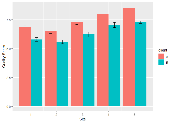
Again, agent is selected in the model. But since agent could lead to overfit, the previous model of week and client is retained. A bar plot of quality score over week and client shows that overall client A has a higher quality score. The score also goes up over week for both clients. But the overall fit is far less ideal compared to the service time prediction. Additional factors need to be considered to achieve a better prediction.
Data Modeling - Random Forest
Now use random forest to predict quality score and service time from the remaining factors.
Data Splitting
Half of the data were randomly drawn as the train data set and the other half as test data set.
Predicting Service Time
Model Building
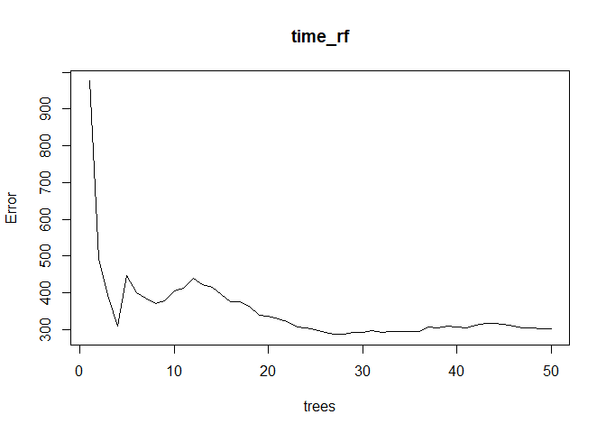
The error rate quickly plateaued near 10 trees.
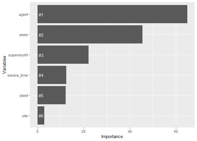
Variable Importance
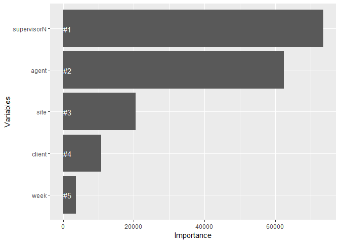
The above visualization shows that supervisor has the most power predicting service time, followed by agent. Site and client information come next in their predictive power. This confirms our analysis in the linear regression section.
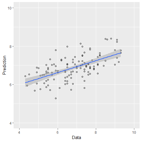
Prediction
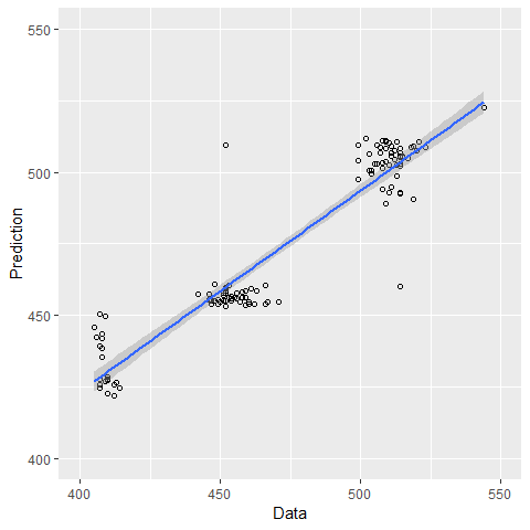
The correlation between data and prediction is 0.94, suggesting that the model can predict the service time really well.
Predicting Quality Score
Model Building
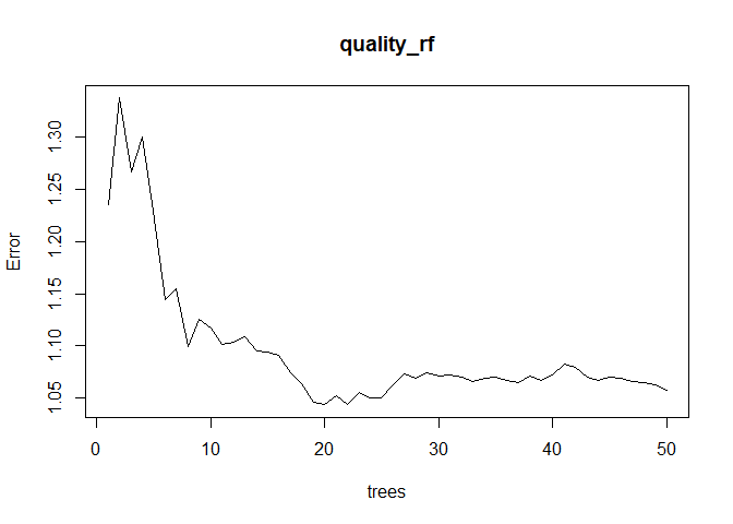
The error rate plateaued near 40 trees.
Variable Importance
The above visualization shows that agent has the most power predicting quality score, followed by week, then supervisor, service time, and client. Agent and supervisor can again be ignored for overfit concerns. But it first surprises me that service time comes as more important than client information, contrary to what we see in the linear regression section. This could be due to that service time is perfectly predicted by site and client information, so that it contains more information than client alone. Since service time correlates with client information, it can be included in predicting quality score in a predictive algorithm, but should not be included in a linear regression model.
Prediction
The correlation between data and prediction is 0.59, suggesting that the model can predict the quality score relatively well but not ideal.
Conclusion
The service time metric is well predicted by site and client information. The East site would be an interesting place to interview to understand the factors that affect this metric, as their service time is at both ends of the spectrum. On the one hand, they do the best job with client B in keeping down service times. Their input on how to keep it down could potentially be useful for other sites. On the other hand, their service time with client A is really high. Thus it would be worthwhile to understand the causes.
The quality score metric is less well understood compared to the service time metric. The client and week information can do an OK job explaining the variance in quality score, but far from ideal. Thus more factors should be included if a better explaining and predicting power is desired. Client A is associated with higher quality score. It would be useful to know whether this is due to quality measurement or if client A is more happy with the service overall. Also, quality score goes up over time. One good question to ask is what changes over time contributed to the increase.
Individual supervisor and agent performance is not analyzed in this report since this report is more about understanding the big picture, or stable factors behind the two important business metrics. Individual performance can be seen in the Power BI dashboard presentation.